


Client
PerMed for an internal employee app called Selok
The Goal
Our long-term partner, Permed, required a clean and modern logo for "Selok," their new internal application for employee scheduling and HR management. The challenge was to create a brand mark that was simple, friendly, and highly versatile. It needed to work seamlessly in both light and dark UI themes, be easily animatable, and remain effective in both 2D (two-color) and 3D applications.
Our Solution
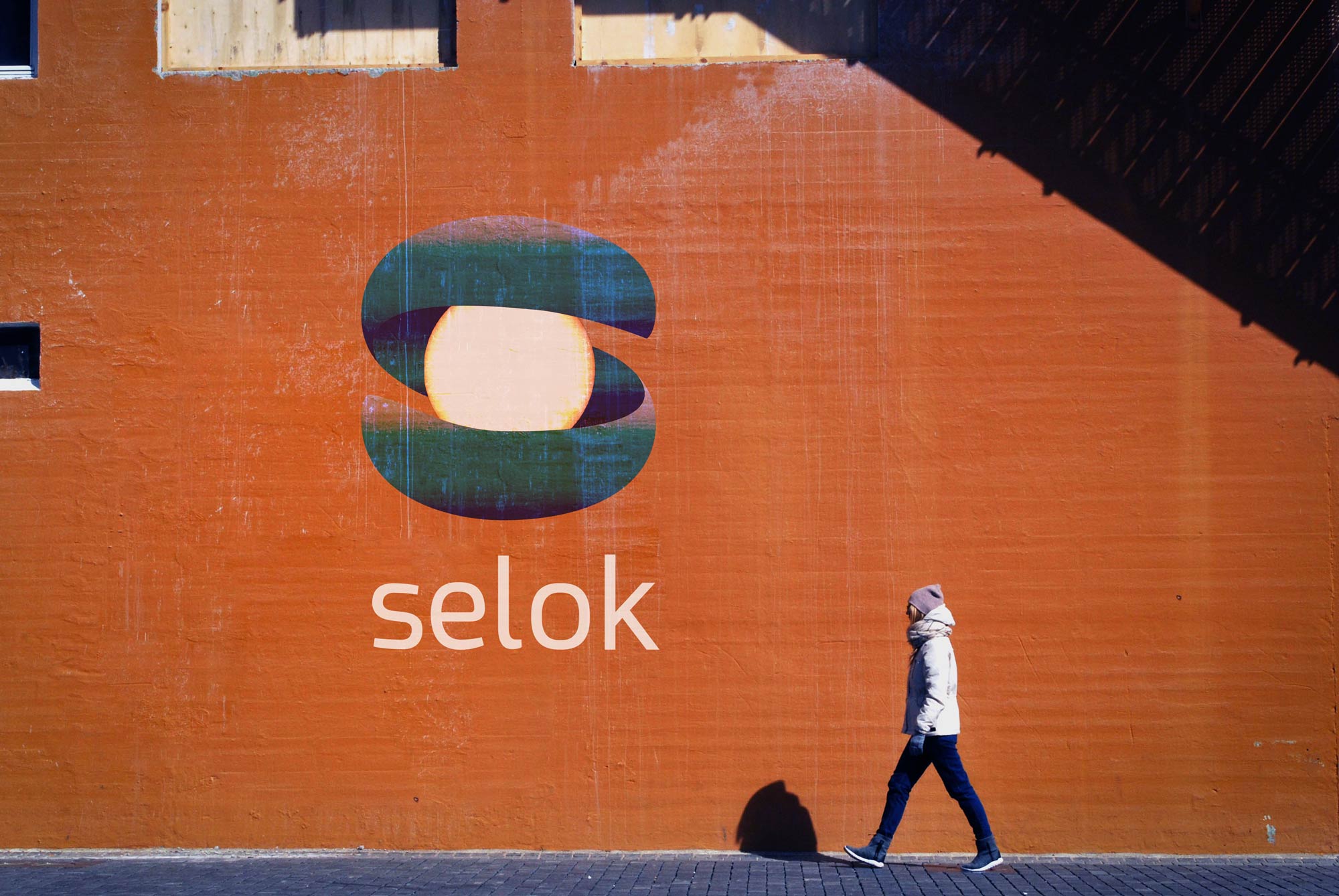
Our solution is a minimalist and fluid monogram that combines the 'S' and 'o' from Selok. The stylized 'S' creates a dynamic path that gently embraces the 'o,' symbolizing support, flow, and seamless organization.
The concept was designed with motion in mind; the simple forms allow for an elegant animation where the 'o' glides along the 'S' curve like a ball on a track, representing the ease of managing schedules and tasks within the app. This clean, two-color design ensures perfect legibility and adaptability across all required formats, from a small app icon to in-house presentations.
The Result
The final logo is a sophisticated yet approachable brand mark that provides a clear and modern identity for an essential internal tool, reinforcing the Permed brand's commitment to its team.