

Client
BEEing Joy - Jobanmeet Kaur
The Brief
Jobanmeet Kaur, known as "Joy" to her followers, sought a playful and optimistic brand identity for her social media platform. The goal was to create a memorable logo that would immediately convey her mission: to spread positivity, offer encouraging insights, and provide guidance for maintaining an optimistic outlook through life's challenges. The brand needed to feel warm, approachable, and truly joyful.
Our Solution
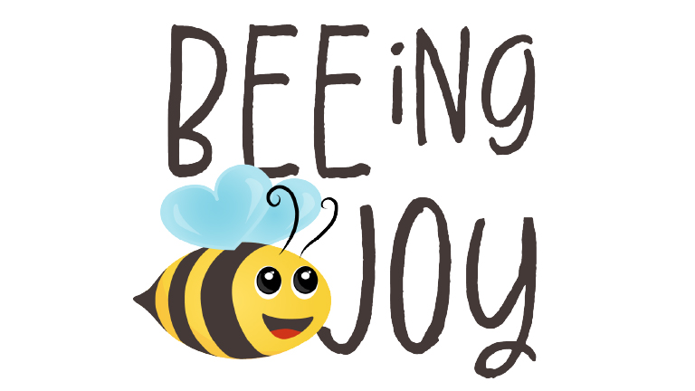
Our solution hinged on a clever and memorable wordplay: BEEing Joy. This concept perfectly fused the client's nickname with the universally understood symbol of a busy, cheerful bee, immediately communicating positivity and community.
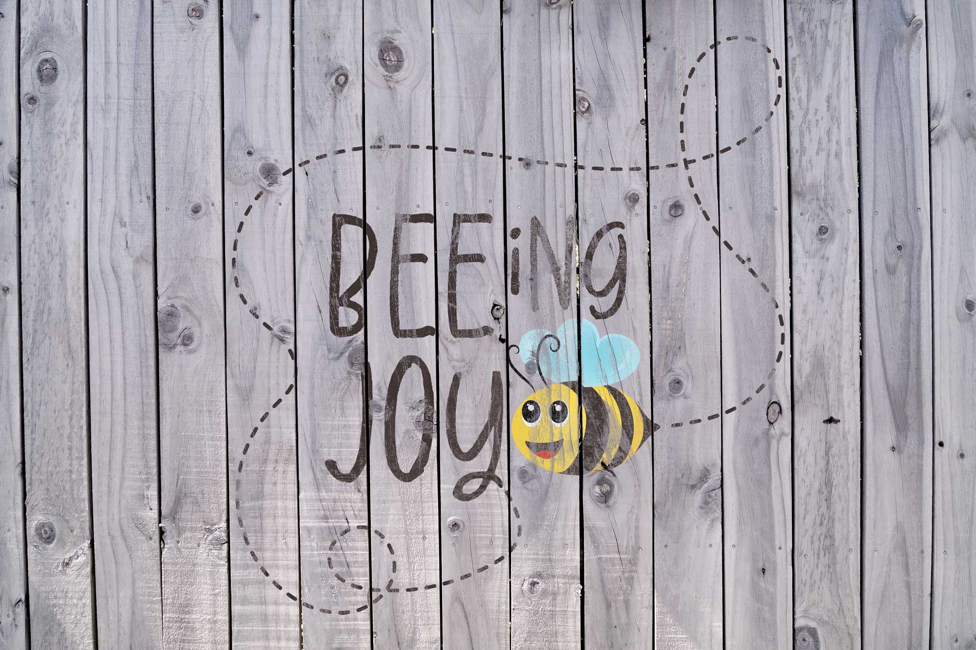
We designed a friendly, animated bee character, complete with an inviting smile and delicate, heart-shaped wings, symbolizing love and optimism. The typography for "BEEing Joy" features a hand-drawn, whimsical style, reinforcing the approachable and personal nature of Jobanmee's content. The brand mark also includes a subtle dotted line, evoking the flight path of a bee, guiding the eye and suggesting the spread of positivity.
The Result
The "BEEing Joy" logo is a vibrant and engaging brand mark that instantly communicates its purpose. It provides Jobanmee Kaur with a unique and heartwarming identity that resonates deeply with her audience, inspiring them to "share the buzz" of positivity and find joy even through tough times.