

Client
KamiFilms
The Brief
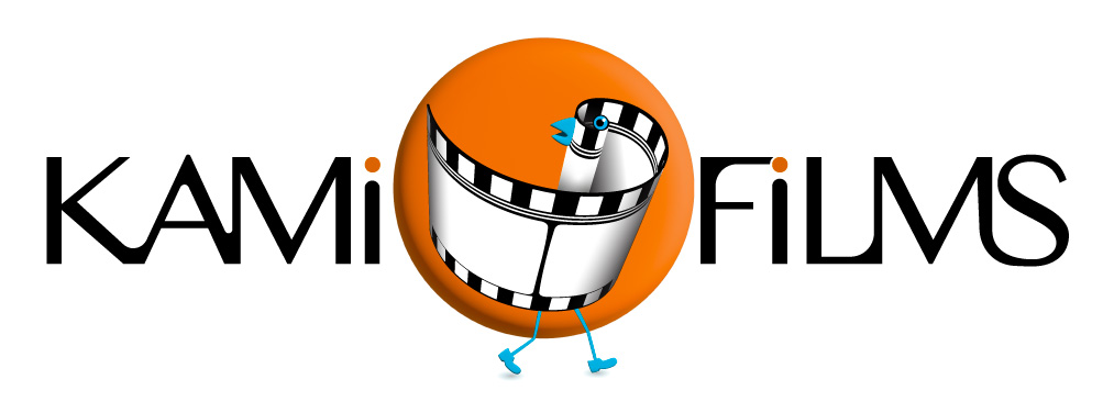
KamiFilms, an independent film production company, needed a logo that was both playful and professional. The key requirement was to prominently feature a classic film roll, but in a way that felt unique and full of personality. The brand mark also needed to be designed with animation potential, ready to come to life as a motion graphic.
Our Solution
Our solution was to transform the film roll from a simple object into a charming, memorable character. We crafted a whimsical bird whose body is formed from a curling strip of film, cleverly fulfilling the client's request. This "film bird" character is designed for animation, with its walking legs giving it an immediate sense of movement and narrative.
The character is set against a warm, symbolic sun, specifically evoking a setting sun. This intentional choice subtly reflects the moment the lights dim in a cinema, inviting the audience into a story and hinting at the captivating narratives KAMI FILMS brings to life. The result is a logo that is not just an image, but a character with a story to tell, perfectly aligned with the cinematic experience.
A sophisticated, modern sans-serif font was chosen for its excellent legibility and professional feel, while the deep blue and red palette communicates strength and patriotism. The result is a balanced and powerful logo that is both clean and distinctly Canadian.
The Result
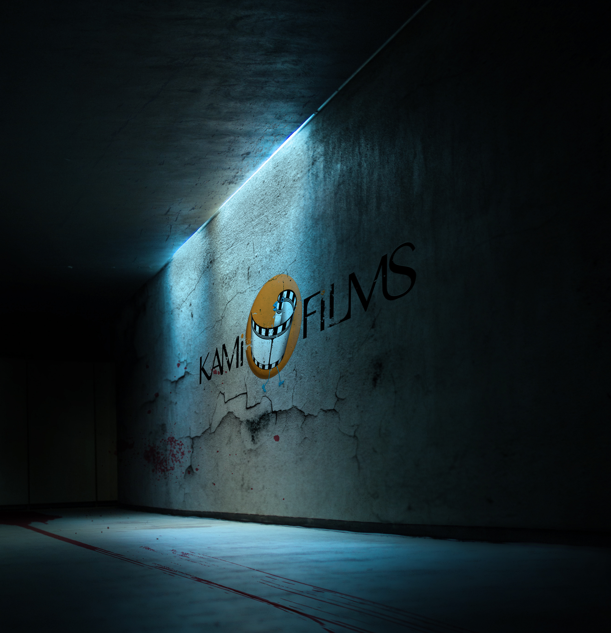
The final logo provides KAMI FILMS with a unique and engaging identity that is perfectly suited for the screen, capturing the creative and story-driven spirit of their work, and building anticipation for every film.