


Client
Frequency Reset Podcast
The Brief
The challenge was to create a compelling brand identity for "Frequency Reset," a new podcast featuring the inspiring stories of "everyday heroes" who have immigrated to Canada. The logo needed to visually represent the podcast's core themes: the journey of navigating cultural change, the process of "calming the inner storm," and the idea of finding a positive new perspective—a personal reset. The design had to be modern, impactful, and versatile enough to work in multiple color schemes and be suitable for animation.
Our Solution
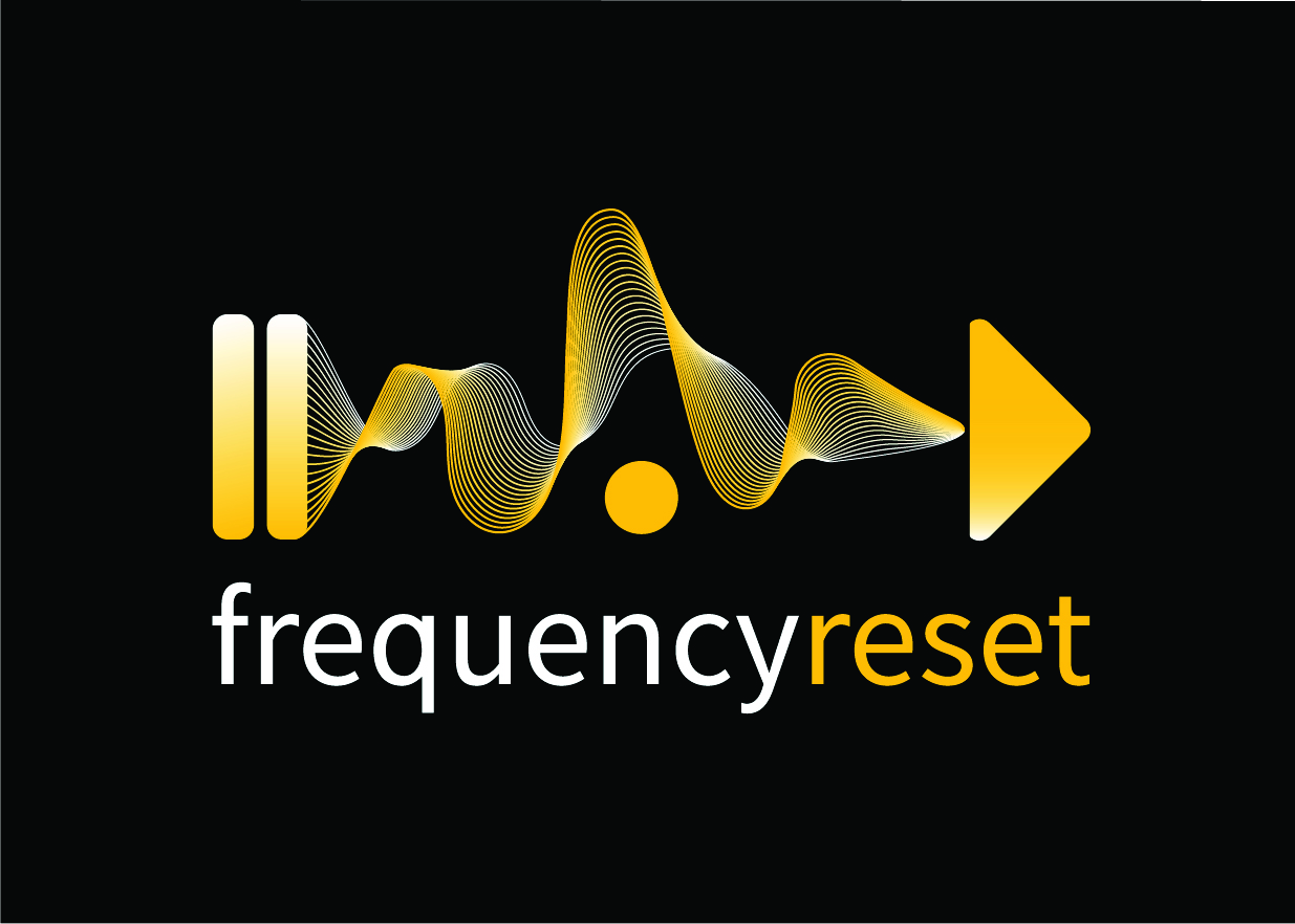
Our concept translates the podcast's name into a powerful visual metaphor. The logo is structured like a media player's timeline, guiding the viewer from left to right:
The Pause Symbol represents taking a necessary break—the moment of reflection to calm the inner storm and gain perspective before moving forward.
The vibrant Frequency Wave in the center symbolizes the journey itself—the highs and lows of life, cultural changes, and the lingering expectations that each guest navigates.
The Play Symbol signifies a new beginning—the "reset" and the start of a new, empowered chapter.
A playful ball element is integrated into the frequency wave, designed to be used in motion graphics and animations to represent the individual's journey through the process. The striking yellow-on-black (or black-on-white) color scheme ensures the logo is vibrant and legible across all podcasting platforms and promotional materials.
The Result
The final logo is a clean, symbolic, and deeply meaningful identity that perfectly encapsulates the "Frequency Reset" journey. It provides a professional and memorable brand mark that not only stands out but also connects to the podcast's internal branding, with episode chapters like "Reset Shelf" and "Sobia's Reset Moment."