

Client
Urban Pilgrim Creators
The Philosophy: Why "Urban Pilgrim Creators"?
Our name is the heart of our philosophy. In today's interconnected world, we see ourselves as "urban pilgrims"—navigating modern landscapes, embarking on creative journeys, and telling stories across international borders. The name represents our passion for exploration, whether we're on location in a new city or discovering the core of a new brand.
The Concept: A Resilient Traveler
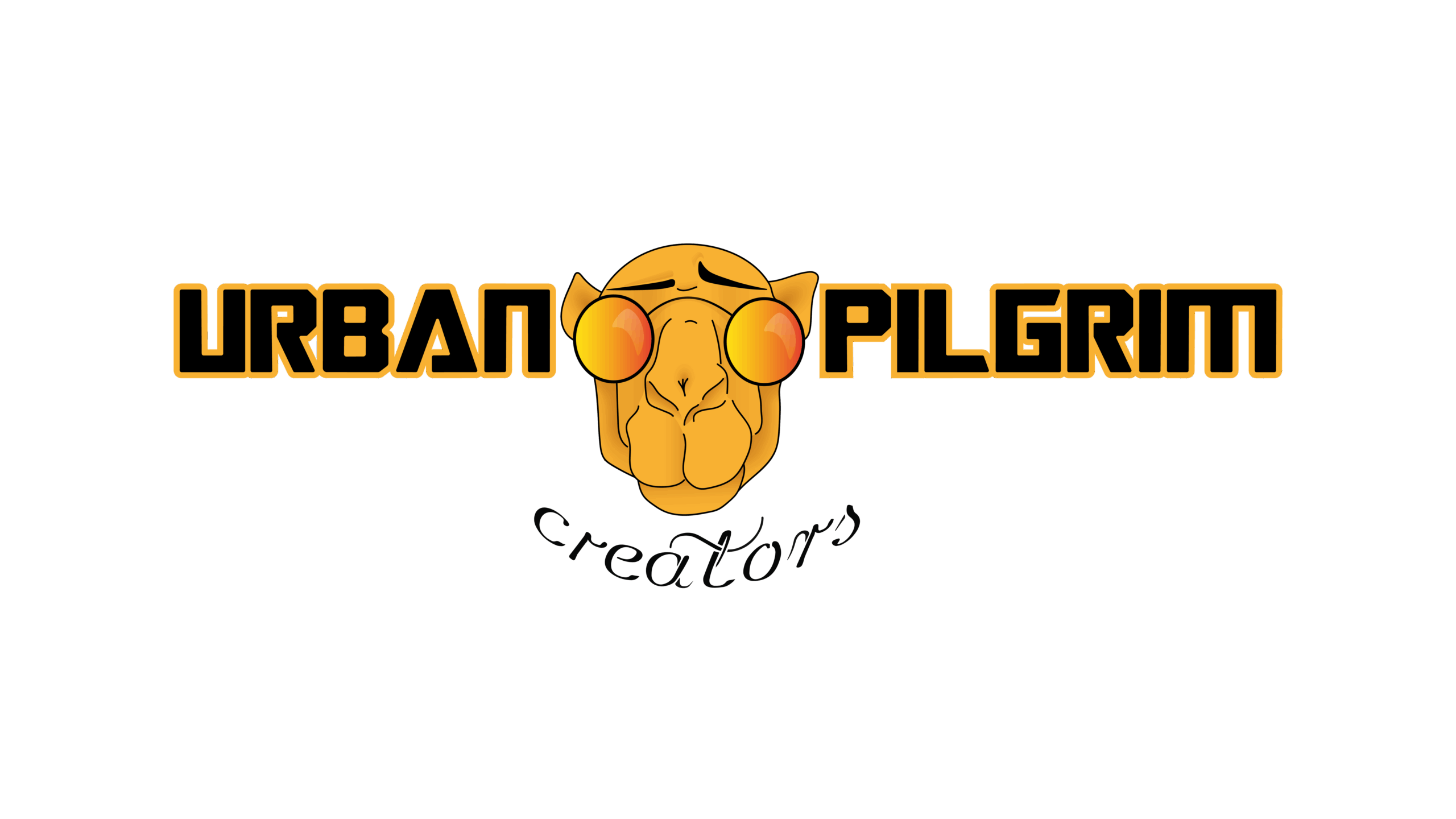
To represent this journey, we chose the camel as our mascot—a timeless symbol of resilience, endurance, and the ability to thrive on long voyages with purpose. Our camel isn't just any traveler; it's an urban pilgrim, cool and observant with its sunglasses on, ready for the next adventure. After exploring more whimsical concepts (including a camel with an antenna!), we settled on this perfect blend of timeless strength and modern style.
The character is set against a warm, symbolic sun, specifically evoking a setting sun. This intentional choice subtly reflects the moment the lights dim in a cinema, inviting the audience into a story and hinting at the captivating narratives KAMI FILMS brings to life. The result is a logo that is not just an image, but a character with a story to tell, perfectly aligned with the cinematic experience.
A sophisticated, modern sans-serif font was chosen for its excellent legibility and professional feel, while the deep blue and red palette communicates strength and patriotism. The result is a balanced and powerful logo that is both clean and distinctly Canadian.
The Design: A Union of Opposites
The visual identity was built on a foundation of meaningful contrast:
Typography: The words "URBAN PILGRIM" are set in a bold, structured, modern font, representing the strategic foundation and the professional journeys we undertake. In contrast, "creators" is written in a free-flowing, playful script, capturing the spark of artistry and the unique, handcrafted nature of our work.
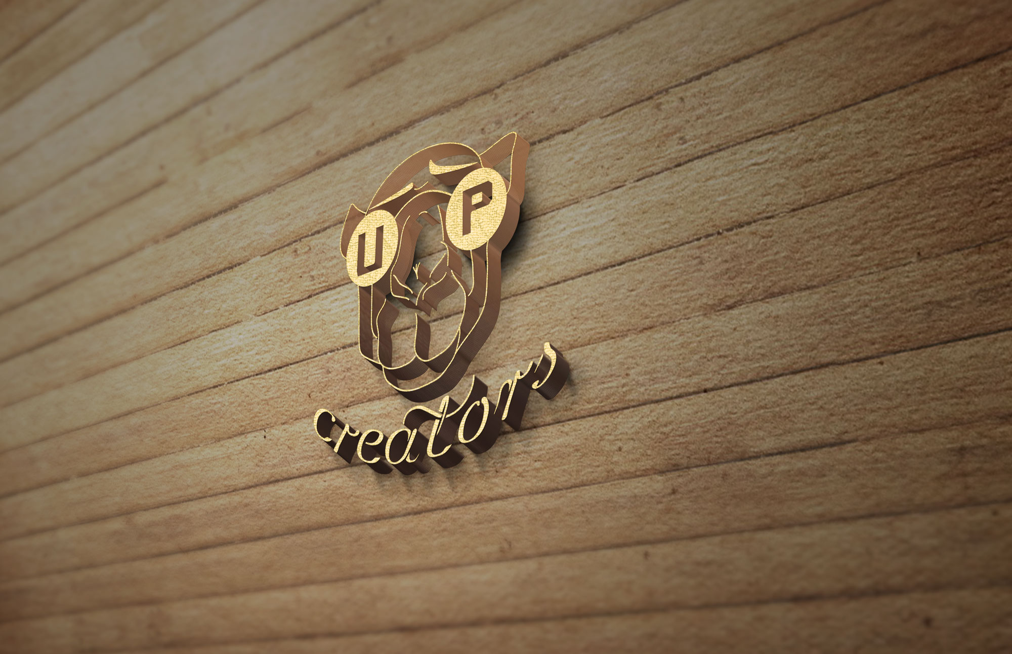
A Flexible System: A great brand needs to be adaptable. We designed a full logo for general use and a compact icon for social media and smaller applications. In this secondary mark, the letters "U" and "P" are cleverly integrated into the lenses of the sunglasses, creating a memorable and versatile symbol of our brand.
The Result
Together, these elements—the name, the mascot, and the typography—create a brand mark that is uniquely us: strategic, adventurous, and (we think ;) ) creative.