

Client
Kunst im Stadl (eng. Art in the Barn)
The Brief
The brief was to design a logo for "Kunst im Stadl"—an art space in a historic barn—that felt both modern and timeless. The brand mark needed to be inviting and versatile, with the unique ability to complement a diverse range of art exhibitions without ever overshadowing the art itself.
Our Solution
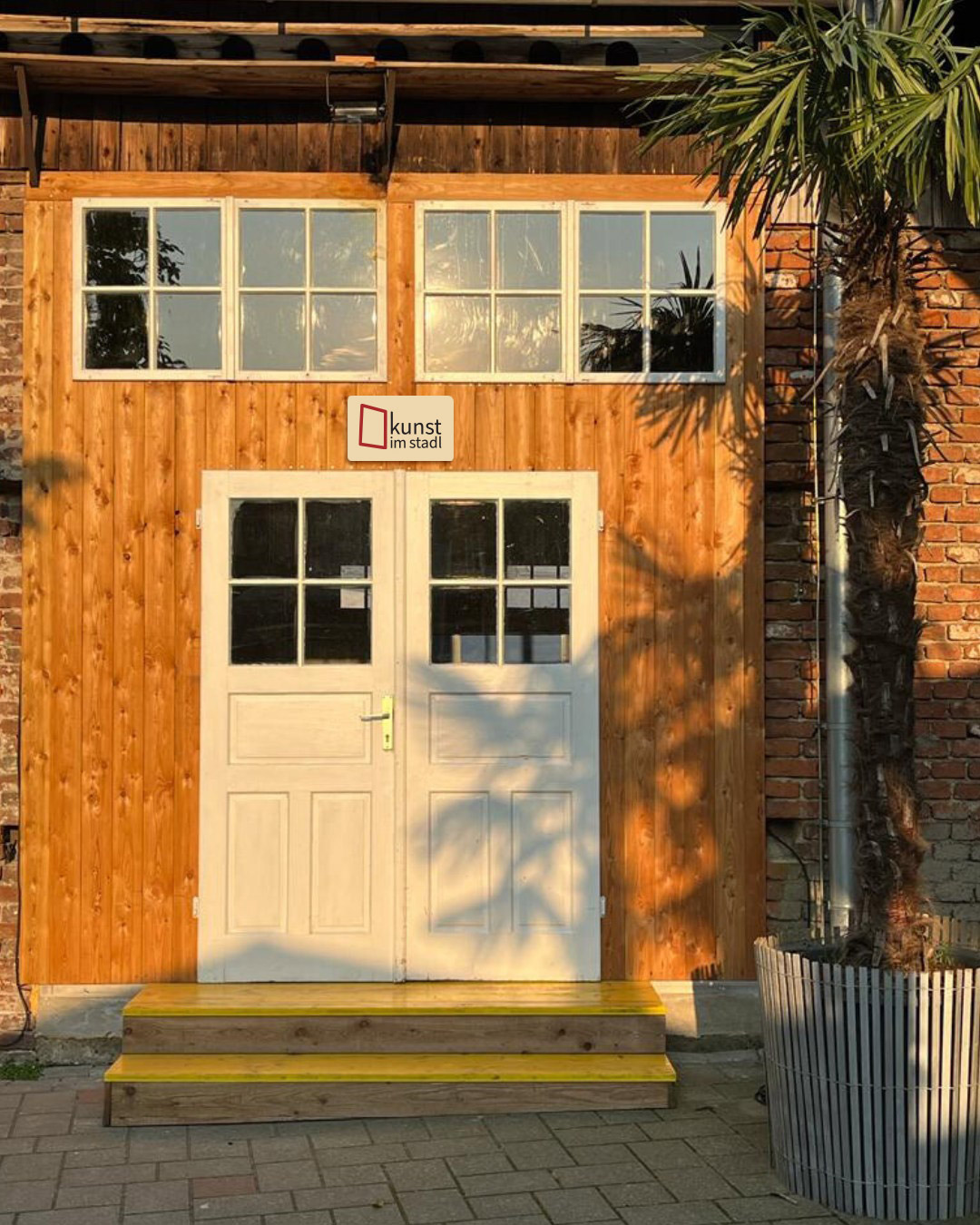
Our inspiration was found in the venue's own architecture. We designed a clean, geometric frame based on one of the barn's actual windows, creating an immediate and authentic connection between the brand and its unique physical space.
This frame acts as a powerful dual symbol: it is both a window inviting the community inside, and a picture frame that honours the art within. A clean, rounded font was chosen to balance the mark, with the text thoughtfully positioned to act as a hinge, visually opening the frame to the viewer and the creative experiences the "Stadl" offers.
The Result
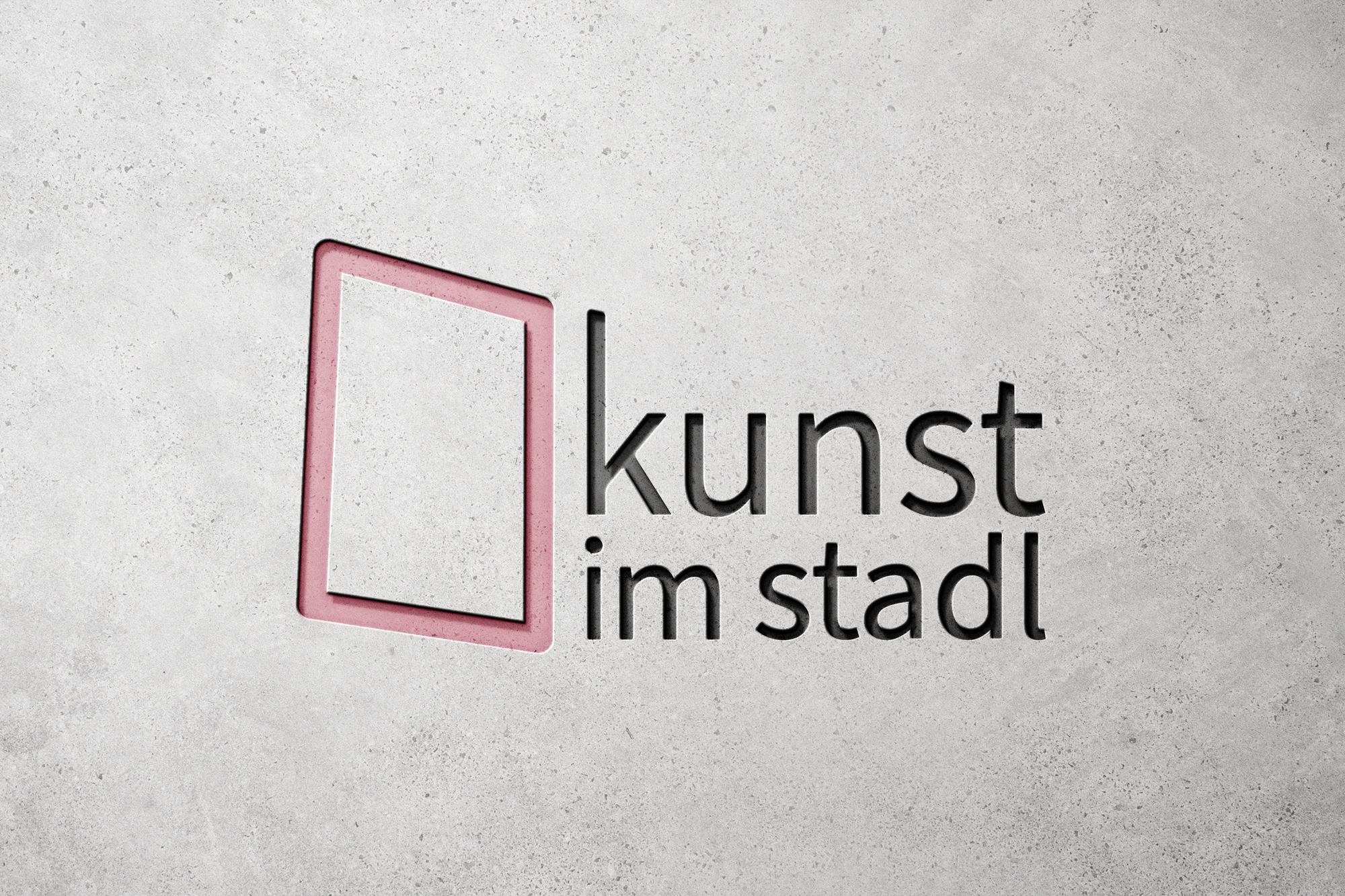
The final logo is a clean, meaningful, and highly versatile brand mark that perfectly reflects the gallery's mission to be an open and accessible space for art.